What customers look for on a one page website before they reach out
Why a single page can work for your business
A one page website does exactly what its name suggests: it puts everything a visitor needs on a single scrollable page. For many small businesses, especially those just starting out or offering a narrow set of services, this format makes sense. It removes the friction of clicking through multiple pages and lets potential customers see your offer, your story and your contact details in one clean sweep. But making that single page effective is not simply a matter of cramming information together. You need to understand what people actually look for before they decide to get in touch.
When someone lands on a one page website, their attention is split. They want to know who you are, what you do, and whether you can solve their problem. They also want reassurance that you are legitimate and easy to reach. If any of these pieces are missing or hard to find, they will leave without making contact. The challenge is to present all of this without overwhelming the visitor or making the page feel cluttered.
The first thing people check: your offer and your credibility
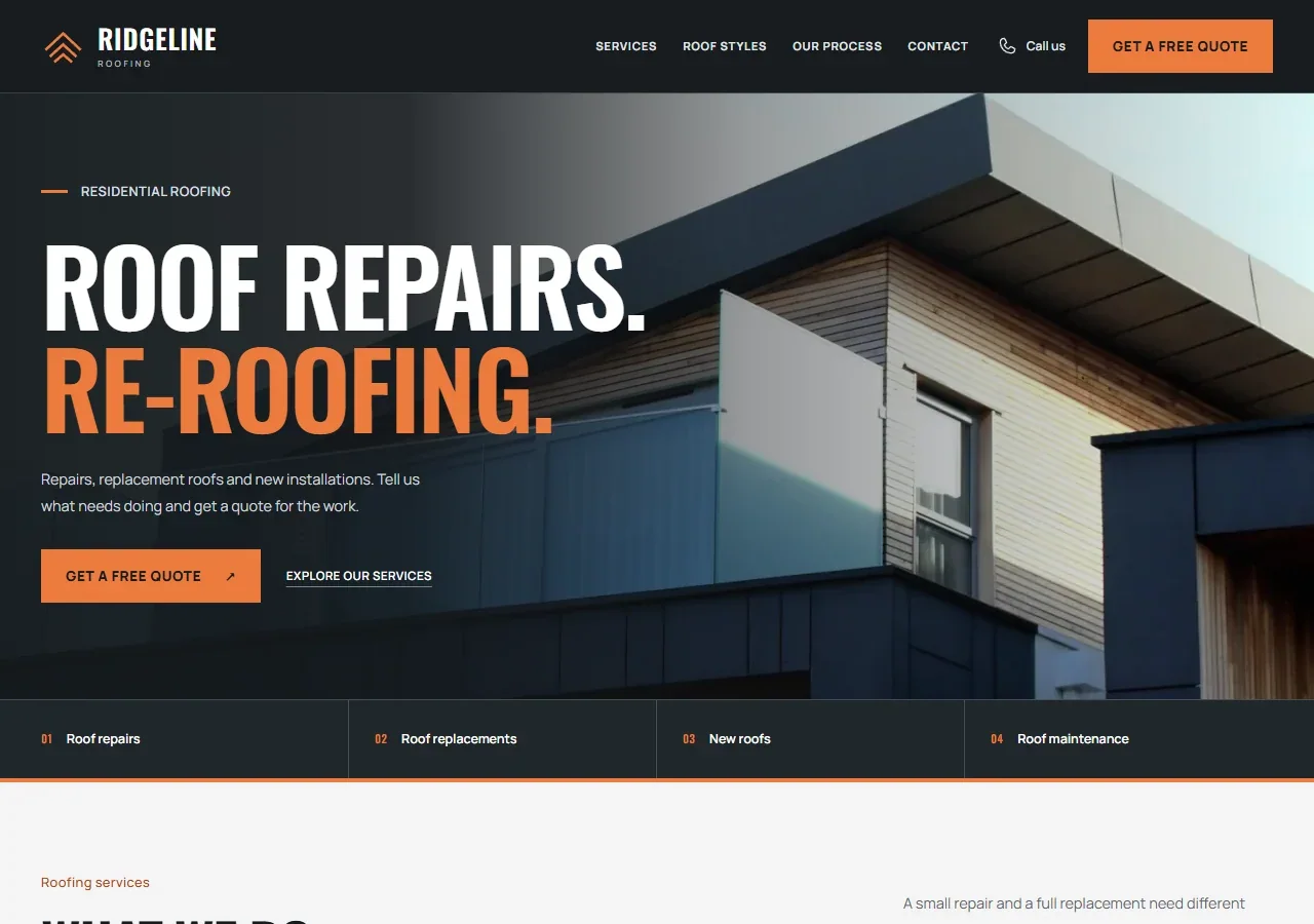
The top section of a one page website, often called the hero area, is where visitors decide whether to stay or go. Within seconds they want to understand your core service. A clear headline, a short supporting sentence, and a visual that reinforces your message all help. But even more important is the immediate sense of trust. People look for signs that you are a real business: a professional logo, consistent branding, and a domain name that matches your business name. A generic free domain or a mismatched email address can raise doubts.
Below the hero, visitors typically scan for social proof. Testimonials, client logos, or case study summaries work well here. If you have none, a brief statement about your experience or the number of projects you have completed can fill the gap. The key is to show that others have trusted you and been satisfied. Without that, the visitor has no reason to believe you will deliver.
Service pages condensed into clear sections
On a traditional multi-page site, you might have separate service pages for each offering. On a one page website, you condense those into sections. Each section should answer three questions: what the service is, who it is for, and what outcome it delivers. Avoid jargon. Use plain language that a non-expert can follow. If you offer multiple services, keep each section brief and use a consistent structure so the reader can compare them easily.

One common mistake is to list features instead of benefits. A feature is "24/7 support"; a benefit is "you get help whenever your business needs it." Visitors care about what your service does for them, not the technical details behind it. When you frame each section around the visitor's problem and your solution, you make it easy for them to see themselves as your customer.
Business details and contact form placement
After reading about your services, the next thing a visitor looks for is how to reach you. They want to know your location, your hours, and the easiest way to get a response. On a one page website, the contact section is usually at the bottom, but you should also include a visible call to action in the hero area and between sections. A simple "Get in touch" button that scrolls smoothly to the contact form is effective.
The contact form itself should ask for only the essential information: name, email, phone number, and a short message. Long forms discourage people from completing them. If you prefer a phone call, display your number prominently. If email works best, make sure the form sends to an address you check daily. Nothing frustrates a potential customer more than sending a message and hearing nothing back. Also include your physical address if you have a storefront or office, as it adds legitimacy and helps with local search visibility.
Mobile layout and quick loading
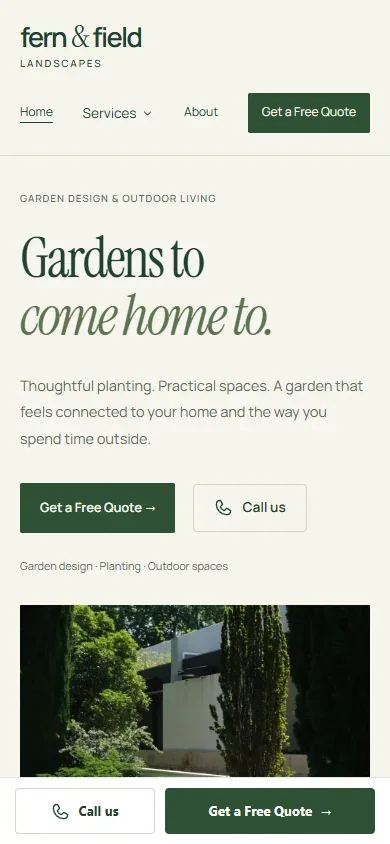
A large portion of visitors will view your one page website on a phone or tablet. If the mobile layout is cramped, buttons are hard to tap, or text is too small, they will leave. Test your site on several devices to ensure everything looks good and works smoothly. The same goes for loading speed. A one page site can become heavy if you load large images or too many scripts. Compress images, use modern formats like WebP, and keep third-party embeds to a minimum. A slow site erodes trust quickly.
Another mobile-specific consideration is the navigation. On a desktop, a sticky menu with links to each section works well. On mobile, a hamburger menu or a simple list of anchor links helps visitors jump to the part they need without endless scrolling. Make sure the menu is easy to use with one hand and that the active section is highlighted.
Website content that answers common questions
Before making contact, people often have questions about pricing, availability, or what happens after they submit a form. You can anticipate these by including a short FAQ section on your one page website. Keep the answers brief and direct. If pricing is straightforward, list it. If it varies, explain the factors and invite a conversation. The goal is to remove as many doubts as possible so the visitor feels informed enough to reach out.
Your website content should also reflect your personality and values. A one page website is a compact space, so every word counts. Write in a tone that matches your brand: friendly, professional, or somewhere in between. Avoid generic phrases like "we are committed to excellence" that say nothing specific. Instead, describe a real scenario: "We help Auckland cafes build simple websites that list their menu, hours, and location." That sentence tells the visitor exactly what you do and who you serve.
For many small businesses, creating a one page website is an affordable business website solution that gets them online quickly without a large upfront investment. The format works best when the offer is clear and the audience is local or niche. If your services are broad or your customers need detailed information before deciding, a multi-page site might be better. But for a focused offer, a well-designed single page can convert visitors into leads just as effectively.
The call to action that works
A call to action on a one page website should be specific. Instead of "Contact us," try "Book a free 15-minute call" or "Send us your project brief." The more specific you are, the more likely the visitor will follow through. Place your main call to action in the hero area, repeat it after your service sections, and include it again in the contact area. Each instance should look like a button, not a text link, and the colour should contrast with the background so it stands out.
Also consider adding a secondary call to action for visitors who are not ready to commit. A newsletter signup, a downloadable guide, or a link to your social media profiles gives them a way to stay connected. Not everyone who visits will contact you immediately, but they might return later if you give them a reason.
What to leave out
A one page website has limited space, so every element must earn its place. Avoid large blocks of text, irrelevant images, or animations that slow down the page. Do not include multiple contact forms or phone numbers that confuse the visitor. Stick to one primary method of contact and make it obvious. Also avoid auto-playing videos or pop-ups that interrupt the reading experience. Visitors who feel annoyed are unlikely to reach out.
Another common mistake is trying to appeal to everyone. If your page tries to serve multiple audiences with very different needs, it will feel generic. Instead, focus on your ideal customer and write directly to them. You can always create separate landing pages for different offers later, but a single page should have a single focus.
Putting it all together
When you design a one page website with the visitor's questions in mind, you create a smooth path from arrival to contact. Start with a clear headline and proof of credibility. Follow with concise service sections that highlight benefits. Make your business details easy to find and your contact form simple. Optimise for mobile and speed. Write content that answers real questions. And use specific calls to action that guide the visitor toward the next step.
For a small business owner, investing in a one page website can be an affordable business website strategy that delivers results without complexity. The key is to treat every inch of that page as valuable real estate. When visitors find exactly what they need without hunting, they are far more likely to pick up the phone or fill out the form. And that is the whole point of having a website in the first place.